Monday, 11 February 2013

Learning New Things (Colour)............

Colour Theory Part 5...........

This post will be on the third colour scheme which is complementary and split-complementary colours, if you want to find out about the other colour schemes posted on this blog please refer to the previous posts.

Complementary colours are pairs of colours that are opposite to each other on the colour wheel, these colours usually work well together as a colour scheme, meaning they help each other to stand out.
For example: Red and green, orange and blue also purple and yellow


Split complementary colours are a variation of the complementary color scheme. In addition to the base color, it uses the two colors adjacent to its complement.
This color scheme has the same strong visual contrast as the complementary color scheme, but has less tension.
for example:red-purple and red orange and green also yellow-orange and yellow and blue 


Learning New things (Colour)........


Colour Theory Part 4.....


So far we have covered primary, secondary, tertiary colours, also warm and cool colours. The last post was on our first colour scheme which was monochromatic and today the post will be on the second colour scheme which is analogous colours.   

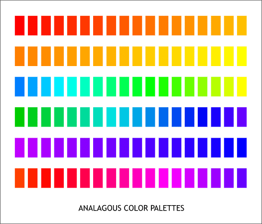
Analogous colors are groups of colors that are adjacent meaning they are near or close or they have a common boundary to each other on the color wheel, with one being the dominant color, which tends to be a primary or secondary color, and two on either side complimenting, which tend to be tertiary.
 An analogous color scheme creates a rich, monochromatic look. It’s best used with either warm or cool colors, creating a look that has a certain temperature as well as proper color harmony. 


Example of Monochromatic colour uses..........