Monday, 11 February 2013

Learning New Things (Colour)............

Colour Theory Part 5...........

This post will be on the third colour scheme which is complementary and split-complementary colours, if you want to find out about the other colour schemes posted on this blog please refer to the previous posts.

Complementary colours are pairs of colours that are opposite to each other on the colour wheel, these colours usually work well together as a colour scheme, meaning they help each other to stand out.
For example: Red and green, orange and blue also purple and yellow


Split complementary colours are a variation of the complementary color scheme. In addition to the base color, it uses the two colors adjacent to its complement.
This color scheme has the same strong visual contrast as the complementary color scheme, but has less tension.
for example:red-purple and red orange and green also yellow-orange and yellow and blue 


Learning New things (Colour)........


Colour Theory Part 4.....


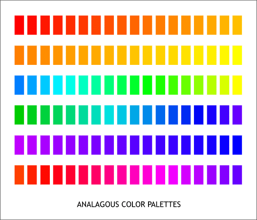
So far we have covered primary, secondary, tertiary colours, also warm and cool colours. The last post was on our first colour scheme which was monochromatic and today the post will be on the second colour scheme which is analogous colours.   

Analogous colors are groups of colors that are adjacent meaning they are near or close or they have a common boundary to each other on the color wheel, with one being the dominant color, which tends to be a primary or secondary color, and two on either side complimenting, which tend to be tertiary.
 An analogous color scheme creates a rich, monochromatic look. It’s best used with either warm or cool colors, creating a look that has a certain temperature as well as proper color harmony. 


Example of Monochromatic colour uses..........


Wednesday, 2 January 2013

Happy New Year!!!!!

I just wanted to wish all of you a beautiful New year, may this year be filled with achievements and dreams coming true.

Note: Use your time wisely and you will achieve everything you wanted to achieve. 

Tuesday, 18 December 2012

Learning New Things (Colour).......

Colour Theory Part 3.......

Today's post is about colour schemes, which normally includes four types of colours but I will only be posting one and the other three colours will be posted on a different post to break it down for you. 
The colour schemes you will be learning about today is monochromatic colours, how they are formed and how to use them in fashion, beauty or even home decorating. 


Monochromatic colours schemes

Monochromatic colour schemes consist of a single hue (base colour) and that hues variations of Value and Intensity of that colour. A monochromatic colour scheme can be created by taking a hue from the colour wheel and creating different shades of it with a certain amount of black, white or grey (white and black) added to it. Adding white to a hue (base colour) is called a tint, adding grey to it is called a tone and adding black to it is called a shade.

Example:


The base colour or hue taken from the colour wheel in this example is RED, when added with a white color you get a tint of red and when added with a grey colour you get a tone of red and finally when added with black you get a shade of red.


Base colour Monochromatic Wheel

base colour starts in the middle (red) clockwise is added white and anti-clockwise is added black.


Standard Monochromatic Wheel 


Example of Monochromatic colour uses..........


Monday, 10 December 2012

Learning new things (Colour)

Colour Theory Part 2.......

This is part 2 of the colour theory posts, for those of you who haven't seen part 1 of this, I suggest you do in order to understand everything in this part of the post. 
so previously I broke down the basic colour wheel explaining what are primary, secondary and tertiary colour's and where they are situated on the wheel; and now I will be explaining the difference between warm and cool colour's how to identify they on the wheel.


The best way I learned to separate the colour's was by thinking about fire and water, the warm colour's should remind you of fire and the colour's that appear in a fire and the cool colour's should remind you of water and all the colour's that appear in the ocean or river or something like that. 


I also found this FAB website that www.colorsolutionsinternational.com  and it a beautiful example of warm and cool colour' s used in fashion.

Fall/Winter 2013 Runway 

Warm colour's 


Cool colour's


hope you enjoyed and learned!!!

Friday, 7 December 2012

Learning new things (Colour).............

Colour Theory Part 1..... 

So, I haven't posted in a while, because I have been investing in my knowledge of fashion and beauty and now I am ready to share what I have learnt YAAAAAAAAAAY!!!!!.
Recently I have been learning about colour theory, primary, secondary and tertiary colour's, warm and cool colours, also colour schemes that include achromatic, monochromatic, analogous and complementary colour's.
Over the next posts I will be separating these colour theories so you can understand them more in detail, and today I will be starting with primary, secondary and tertiary colour's.


Standard Colour wheel  


Primary colours:
Colours that cannot be made from a combination of any other colours, a standard colour by it'self and form all the other colours on the wheel these colours are red, blue and yellow. 
These colours are situated in a form of a triangle on the colour wheel. 


Secondary colours:
Colours that are created from a combination of two primary colours. these colours are green (blue + yellow), orange (yellow + red) and purple (red + blue). These colours are situated in between the two primary colours they are mixed with on the colour wheel and shape an upside down triangle
on the wheel


A colour wheel without tertiary colours


Tertiary colours:
Colours that are a combination of two colours which are nearest to each other on the wheel (see diagram above) primary combined with a secondary colour. These colours are, yellow orange, red orange, red purple, blue purple, blue green and yellow green. these colours are situated in between a primary and a secondary colour on the colour wheel.

Yellow + Orange = YELLOW-ORANGE
Red + Orange = RED-ORANGE
Red + Violet = RED-PURPLE
Blue + Violet = BLUE-PURPLE
Blue + Green = BLUE-GREEN
Yellow + Green = YELLOW-GREEN


A colour wheel with tertiary colours:


well hope you enjoyed the first lesson of colour theory and understood it, to be continued......... 


Saturday, 27 October 2012

Autumn Glow.........

I have been in this country for more then 10 years and every Autumn/Winter the majority of the nation goes grey...as in everyone starts wearing these dull gloomy colours that are so depressing and cold making them blend in with the weather. Now I for one hate first of all looking like someone else and secondly hate not having colour in my life. So me being me, put together my Autumn glow outfit with some of my favourite colours. 

Hope you like, Enjoy xx

Autumn Glow